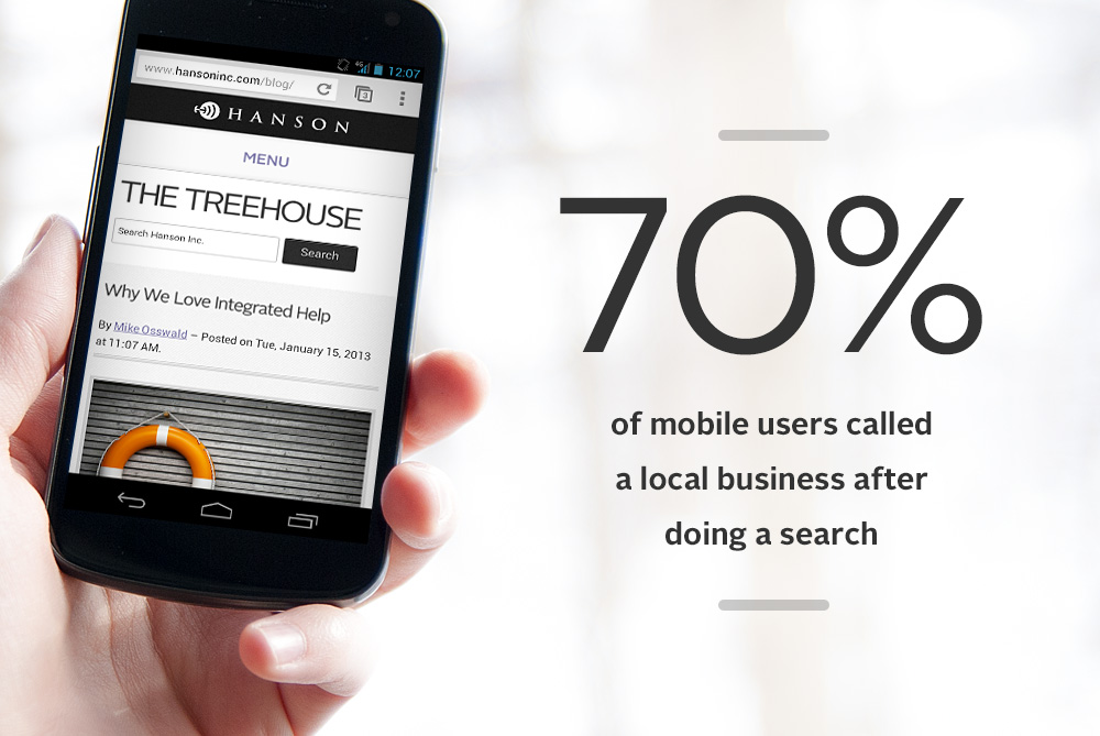
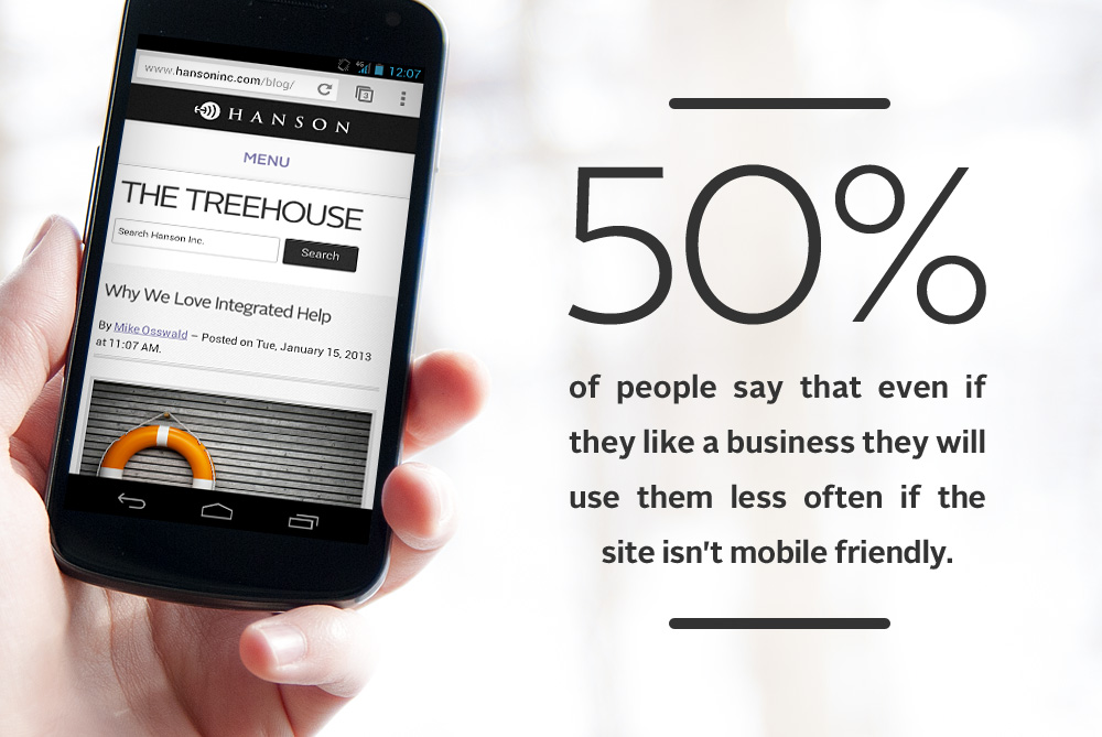
visual representation of the design systems concept as the cure for responsively-challenged sites

Design Systems: The Cure for the Responsively-Challenged Site

In my previous post, I reviewed some of the characteristics of responsively-challenged sites. I ended with this mantra: To move forward, we have to discard the idea of web pages and instead create design systems. Tomorrow’s web will be designed and built from collections of content modules, each optimized to provide the best experience for each type of viewing device. Today I’ll outline a new responsive process that we’re using at Hanson to create a better end product with fewer wasted steps.
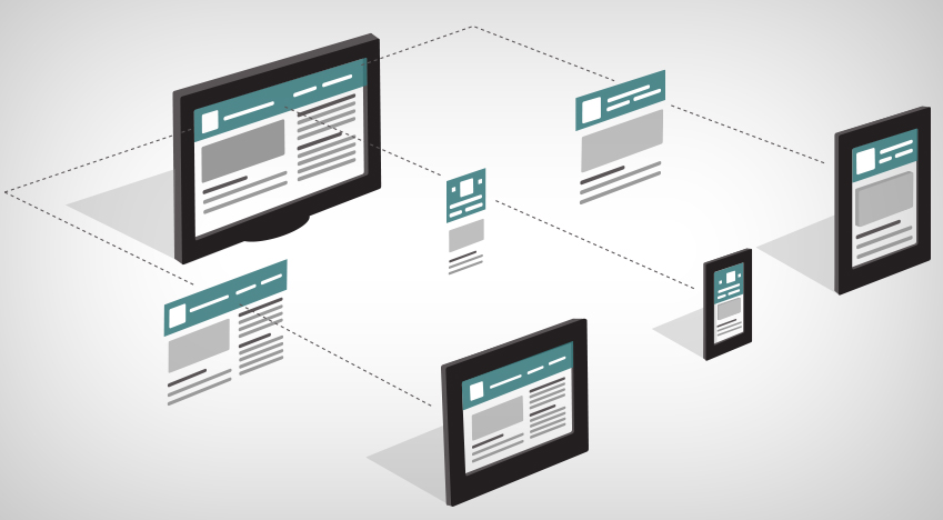
visual representation of the challenges of a non-responsively designed website

Is Your Site Responsively-Challenged?

This year, the world wide web turns 25. It’s been a long, sometimes awkward journey to adulthood (a journey I recently summarized elsewhere). From simple beginnings (check out the first website ever published), the web has grown up to change the world. Recently we’ve seen the web transcend the computer and become ubiquitous. That ubiquity presents a problem for people who write, design, and build content.
photo of Josh Clark at SXSW 2014 "Mind the Gap: UI Design Between & Among Devices" Session

SXSW 2014: Designing for Every Screen, No Screen and Between Devices

Designing for our multi-device world was a big theme at SXSW 2014. According to Kerry Bodine, a panelist at the “From Every Screen to No-Screen: Next Gen Responsive” session, approximately 1.5 billion people have PCs, 1.5 billion people have smart phones, and 425 million people have tablets. So it’s no surprise that we’ve all become comfortable with the concept of responsive design for websites, ensuring that the display of our content adapts to be usable on different sized screens. But we shouldn’t get so comfortable with the concept that we stop looking at what’s next on the horizon.
4 Questions for Planning a Mobile Site

4 Questions for Planning a Mobile Site

Back in January, I wrote about how a bad mobile experience leads to a bad brand experience. I urged you, if you hadn’t already, to make 2013 the year your business goes mobile. If you've taken that resolution to heart, you might be wondering: how do I get there? Here are four questions to ask yourself when planning a mobile site.
mobile friendly websites will win in 2013

Make 2013 the Year Your Brand Goes Mobile

Have you made any New Year’s resolutions for your brand? With 2013 predicted to be the year that more people access the internet via mobile devices than a PC, it’s fair to say that if your site isn’t mobile optimized yet, now is the time to do it...
5 Things Your interactive Designer Wants You to Know

5 Things Your Interactive Designer Wants You to Know

As an interactive designer, I work with clients everyday, sorting out the nitty gritty of how to present information on a page in order to sell a product or service. It’s a privilege to collaborate on client projects, and it’s rewarding. But sometimes designers are misunderstood, and we don’t always have the opportunity to explain why and how we do what we do. So if you’ve ever wondered what your designer was thinking, here are five possibilities..

SlideShare: What is Responsive Design?

Think about how you typically consume information on the internet. PC? Tablet? Smartphone? TV? Internet consumption is an essential part of our everyday life. But the devices we use to consume this content are multiplying and changing at a rapid pace. And these devices differ in screen size, resolution, and interface, to mention just a few variations. To give users access to this content via a variety of devices, we have to start making websites more flexible or responsive. By changing how we think about website design, we can maximize our audiences without having to rethink the wheel for every individual device. Our slideshare shows you how...