Design Systems: The Cure for the Responsively-Challenged Site
In my previous post, I reviewed some of the characteristics of responsively-challenged sites. I ended with this mantra:
To move forward, we have to discard the idea of web pages and instead create design systems. Tomorrow’s web will be designed and built from collections of content modules, each optimized to provide the best experience for each type of viewing device.
Today I’ll outline a new responsive process that we’re using at Hanson to create a better end product with fewer wasted steps. The core of the new process is tighter collaboration between the people who plan and design web experiences. Instead of handing responsibility from team to team and generating reams of short-term documentation, we’re getting together more often, and more quickly, to produce a smaller set of deliverables that evolves with the project and minimizes waste.
The Team
First, let me introduce the collaborators:
The content strategist develops the messaging strategy of a project by assessing audience information needs, auditing existing content, researching trends, and creating findable, relevant and on-brand content in multiple forms.
The user experience architect plans the experience and architecture of a project; uses research, interviews and in-person or remote testing to understand user goals; and lays out the structure and behavior of the interface.
The visual designer interprets and applies a company’s brand to a project, creating visual design systems that mesh with and extend a company’s existing branded experiences.
The front-end developer builds digital interfaces that incorporate usability, branding and content defined by the other roles above, and works with engineers to tie the interface to existing data and business rules.
The Process
While some steps may be combined or happen simultaneously depending on project specifics, these are the essential actions of a new process of creating design systems instead of so-called web pages.
Step 1: Content Inventory and Audit
Who’s involved: content strategist, user experience architect
In “web page” design, the design process often starts with a layout and leaves holes for the content that will come later. And when it comes, the content often doesn’t fit into these holes, requiring the layout to be tweaked.
The process of creating design systems starts with a content inventory and audit. The content strategist analyzes all existing collateral including sites, apps, and even relevant printed materials. The inventory is often a spreadsheet with one line per page, feature, or piece of collateral, and it has fields for notes about what type of content it is, who it’s for, what it links to, and so forth.
Next, the content strategist audits each piece of content for usability, actionability, search optimization, and more. The content audit contains a list of recommendations, for example: creating missing content to fill an unmet need (people are looking for a store directory but it’s not there), rewriting existing content (for grammar, brand tone, or better search-friendliness), or creating alternate formats (for example, turning a news article into an infographic or a video).
Step 2: Sitemap / Content Outline
Who’s involved: content strategist, user experience architect
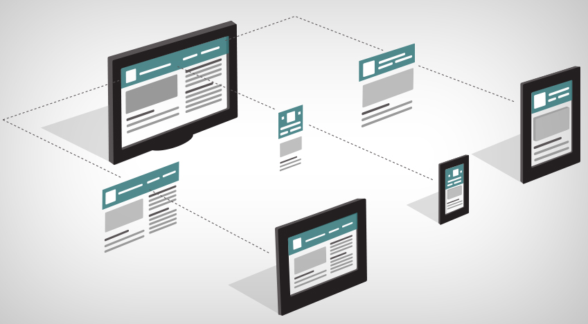
After we understand the content and have a plan for improvements, the user experience architect conducts research to figure out how best to arrange the content. This depends greatly on who the end users are, what their needs are, and how and when they will be using the site. Responsive makes this especially challenging since a user looking for specific information on a phone while in a store or on the road will have different needs from a user who’s browsing on a tablet or PC at home.
The document we create to describe the architecture and behavior of a site is called the functional specification, or “the spec” for short. A spec begins with a sitemap. The architect organizes content from the content inventory and creates a diagram to show how everything is related.

Following the site map, each page in the spec starts as a list of all the content in that view. An example view might look like this:
- Masthead
- Main navigation
- Login / logout / edit profile menu
- News bar
- Search box
- Article content
- Footer
- Copyright statement
In my last post, I explained why the order of these components (the “content hierarchy”) is important, and cautioned against layouts that lack organization or try to cram in too much. The most important content should come first in the content hierarchy so users don’t have to scroll far to find what they need. If a piece of content doesn’t complement the others, it probably belongs on a different page.
Step 3: Visual Design Impressions
Who’s involved: visual designer, user experience architect
Good design is more than the sum of its parts. Even when creating a system of small pieces, it’s important for designers and clients to understand how it all comes together. To help facilitate this, we create high-fidelity impressions of one or two screens in a variety of environments including PCs, tablets, and phones.
Some groups have embraced approaches like Style Tiles, which lie somewhere between a mood board and a comp, but for us, a comp works best. These design impressions won’t exactly match the end product, and that’s okay. Page comps help designers push boundaries. Designing without considering the big picture creates layouts that can feel boxy; looking at whole pages helps us break the mold and achieve the best look.
Example visual design impressions:

Step 4: Identify and Prototype Modules
Who’s involved: user experience architect, visual designer, front-end developer
Now that we understand the content and have a shared vision, it’s time to create modules. A module is the presentation and behavior wrapped around a certain type of content. A news story, a product listing, and a calendar of events are all examples of modules.
The user experience architect, visual designer, and front-end developer build a list of modules used across the entire site. This team sits together reviewing the content on each page of the spec and sketching their ideas for each module. They look for common features and then discuss how they might work on a phone, a tablet, or a PC. A module guide sheet like the one below is useful for sketching variations of modules and layouts at different sizes.
Example module guide sheet:

The user experience architect collects the notes and sketches and expands them into wireframes, or low-fidelity drawings with detailed notes about functionality. At Hanson we use Axure, a rapid prototyping tool, but wireframes can also be a Visio or Illustrator document, or even HTML. The wireframes then become part of the spec.
About this time, we start to think about breakpoints. A breakpoint is a screen width or height at which the layout of a module changes. On the phone below, the events calendar is most readable as a list. But on a larger screen with more space available, a table makes more sense.

Step 5: Visual Design System
Who’s involved: visual designer, user experience architect, front-end developer
After designer, architect, and client agree on the visual direction, it’s time to flesh out the visual design system. This is a Photoshop file that contains examples of all the colors, fonts, typography, and modules that make up the site, with notes for future designers working within the same system.
Example visual design system document:

Step 6: Front-end Style guide
Who’s involved: front-end developer, visual designer
Once the design system is defined, it’s time to build. The final deliverable before we start creating views is the front-end style guide. This is an HTML page that brings the design system to life. The style guide contains working examples of all the modules. The page is responsive to demonstrate how each module behaves at every breakpoint.
Example front-end style guide:

A front-end style guide includes further documentation of how each module is built and is useful for any developer or designer who works on a project in the future.
CSS frameworks make building a design system easier. A good framework provides building blocks for a site’s layout grid and common modules like menus, buttons, and tables. We use Bootstrap but there are many other excellent frameworks including Foundation, Gumby, and InuitCSS. Whether or not you start with a framework, the style guide will become a “mini-Bootstrap” specific to your project.
The redesign is just the beginning
A shiny new site is exciting, but real success is measured in the months and years after launch. Sites are prone to decay over time as they change hands and the design drifts away from the original vision.
The three key deliverables that come from our process (content audit, functional spec, and design system) are meant to grow and change with the site. The content audit will lay out a plan for more and better content into the future. It may even become a content calendar that lays out a regular publishing schedule.
With a design system in place, future enhancements become easier. Adding new features means re-running the design process in miniature.
On a recent project, we built a set of page templates and turned them over to a client. The client loved them, and asked for several more as quickly as we could produce them. Architect, designer, and developer met and discussed the changes. We were able to go from request to three new pages in 24 hours! The key documents were updated and the design system was that much richer. The system we put in place will direct future work on that brand, and is already being adopted for other brands within the same client.
Building design systems isn’t hard, but it does require you to reevaluate your priorities. Understanding your content is key. Strong sites flow from strong content.
Instead of working in stages and generating extensive documentation, bring the whole team in sooner and work together on a smaller set of living documents. You’ll reduce wasted work and have a stronger product.
Make 2014 the year you go responsive. Get your content in order, create a design system and lay a strong foundation for the future. You’ll be glad you did.