
SXSW 2014: Designing for Every Screen, No Screen and Between Devices
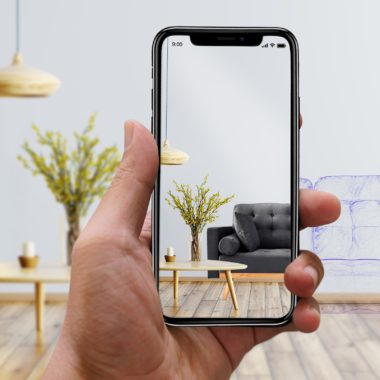
Designing for our multi-device world was a big theme at SXSW 2014. According to Kerry Bodine, a panelist at the “From Every Screen to No-Screen: Next Gen Responsive” session, approximately 1.5 billion people have PCs, 1.5 billion people have smart phones, and 425 million people have tablets. So it’s no surprise that we’ve all become comfortable with the concept of responsive design for websites, ensuring that the display of our content adapts to be usable on different sized screens.
But we shouldn’t get so comfortable with the concept that we stop looking at what’s next on the horizon: 22 million digital signs by 2015, 171 million wearables by 2016, and 25 billion internet-connected devices by 2015 (projected to grow to 50 billion by 2020).
In the near term, we need to ensure that our responsive designs aren’t just skin deep. Simply delivering the same content and adjusting how it is laid out works, and will likely continue to work, for a number of use cases – but we need to be thinking about what more we can and should be doing to create experiences that respond not only to the size of the screen, but the complete context of how and where the content is being viewed.
This context can affect how we structure our data as well as planning for adding additional layers to the experience based on device capability. A simple example of this was discussed in another presentation on “The UX of Real Time Site Personalization,” where Jesse Friedman suggested a restaurant site displaying more targeted reservation calls to action or even coupons based on your proximity to the business using device geolocation.
More and more brands are finding that they need to design how the experience responds on different devices, not just the content. According to Chris Saint-Amant, another panelist at the Next Gen Responsive session, Netflix did away with their m.netflix.com domain and rebuilt their sign-up process to be responsive – to deliver one experience to all devices and even embedding it into their app experiences (the main netflix site was left as desktop only). However, if you look at the experience of browsing and watching media through the service (which is available on over 1,000 different devices), it seems clear that they’ve tailored the experiences for each device or at least each device level (website, phone/tablet, 10ft viewing) and logically focused their efforts on providing the best experience on viewing devices other than the desktop site.
Even if the Netflix experience feels a little different jumping from device to device, this is a great example of sharing an experience across devices – the show I started watching on the Apple TV in the living room or the Xbox in the basement, I often finish watching on an iPad in bed at the end of the day.
This concept of experiences between devices was discussed in depth in another great presentation by Josh Clark called “Mind the Gap: UI Design Between & Among Devices.” According to Clark, 90% of multi-device owners accomplish a single task across multiple screens. And even though we’ve gotten very good at designing websites and applications that look good across an ever growing array of devices, we aren’t always good and developing websites and applications that interact well across devices.
We’re all used to emailing links, or photos, or other content to ourselves as a way to transfer information from one device to another, or using a service like dropbox to sync content between devices. Beyond syncing content across devices, services like Kindle and Netflix are making us accustomed to syncing tasks and behaviors across devices, so that I can pick up an experience exactly where I left off on another device.
This is why future devices need to build in a simpler way to transfer from devices that are right next to each other, particularly devices made by the same manufacturer. Companies like Google are working on prototype experiences that use the camera on your smartphone to transfer a map and its data from your computer screen. Others are using WebSockets or WebRTC to share experiences simultaneously between machines. Developers have even created libraries to use ultrasonic sound to transfer data from one device to another.
And then there are the new technologies for physical gesture control, like the Myo armband and Leap Motion. These are adding new types of interactions (not to replace the mouse: “never ever ever ever try to out-mouse the mouse”) that help bridge the gap between devices and between connected physical objects and other devices, bringing UI into the physical world.
As we hear more and more about wearables and the “internet of things,” it’s important to lift our sights higher than developing a single site experience, and instead start to think about how we can create fully connected experiences that truly delight the end user.
For more coverage from our team at SXSW 2014, see Redesigning the Workplace for Talent Development, Managing the Generation Mash-up and Should Brands be Part of the Real-Time Conversation?

