mobile friendly websites will win in 2013

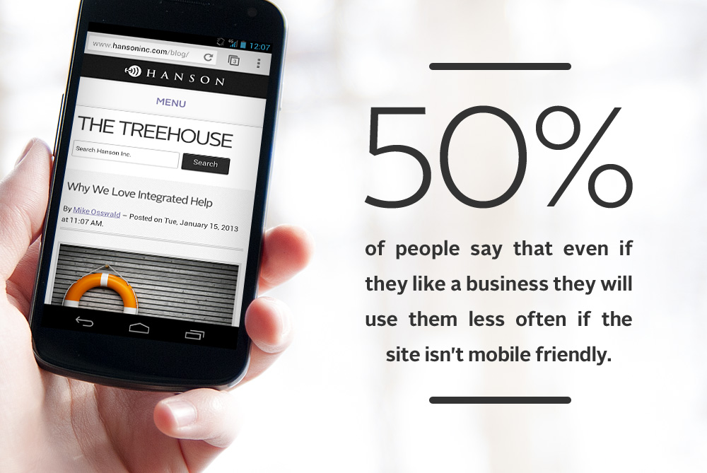
Make 2013 the Year Your Brand Goes Mobile

Have you made any New Year’s resolutions for your brand? With 2013 predicted to be the year that more people access the internet via mobile devices than a PC, it’s fair to say that if your site isn’t mobile optimized yet, now is the time to do it...

6 Tips for Better Mobile Video

With the holidays upon us, there are plenty of opportunities for mom and dad to bust out their new tablet, phone or other mobile tech to capture the sights and sounds of the season. Although today’s devices make it easy to capture video, there’s no guarantee of “good” video. So here are some simple tips to transform you into the Spielberg of your family...
Tips for Developing Successful Mobile Apps

Tips for Developing a Successful Mobile App

Seems there’s an app for everything. And why not? Mobile apps are a fun way to keep your brand in front of customers, and when done right, they make people’s lives easier. If you’re considering developing a new mobile app, here are a few tips from our app development team to make it successful...
You Are Here Toledo mobile app

You Are Here Toledo

What’s better than checking in to a location via your smartphone? Learning something cool about the place you’re standing. This week saw the official launch of a mobile app Hanson developed to support the AIGA Toledo and The Arts Commission public arts project known as "You Are Here Toledo”...
4 Digital Tools to Turn Desk Dwellers into Fitness Fanatics

4 Digital Tools to Convert Desk Dwellers into Fitness Fanatics

They say a person’s health can be judged by which he takes two at a time---pills or stairs. Desk jobs are notorious for weight gain, back pain and other health problems. But here at Hanson, digital innovation is our middle name. So it is no surprise that digital and fitness have formed a healthy (pun intended!) bond. We spend a lot of time at our desks creating digital experiences, but we’ve also embraced the healthy lifestyle concept in numerous ways...

SlideShare: What is Responsive Design?

Think about how you typically consume information on the internet. PC? Tablet? Smartphone? TV? Internet consumption is an essential part of our everyday life. But the devices we use to consume this content are multiplying and changing at a rapid pace. And these devices differ in screen size, resolution, and interface, to mention just a few variations. To give users access to this content via a variety of devices, we have to start making websites more flexible or responsive. By changing how we think about website design, we can maximize our audiences without having to rethink the wheel for every individual device. Our slideshare shows you how...