
Device Detection, Decoded
I was recently reading a proposal, and a certain phrase caught my eye: “If the visitor is on a desktop or a tablet, use feature A. If they’re on a phone, use feature B.”
Okay, I thought. Simple enough. Until I went to talk to some members of my team. An hour later, the whole Hanson front-end development team and half the engineering team were engaged in a debate centered on the question “What is a phone?”
To a human, such a question seems silly. Anyone can see the difference between a phone and a laptop, or a tablet and a watch, but from the limited perspective of a computer, every device looks like just another computer. So put on your web developer hat and follow me as we attempt to answer a simple question in a complicated way.
What Do We Really Know?
Developers have two sources of information about the devices that interact with our sites. Every web browser, whether on a computer, a phone, a watch, or a fridge, supports a set of application programming interfaces, or APIs. These APIs provide a set of inputs and outputs from physical hardware and sensors to the browser—we can collect mouse clicks, touch gestures, keyboard events, and so on, and update the interface accordingly. Web APIs also store some information about the device, such as the size of the screen (or browser window) and the device’s pixel density.
Some of the information contained in web APIs is available to CSS, the visual language of the web. A CSS feature called media queries lets us to create special styles for certain classes of device. Here’s an example CSS rule, and a media query that overrides it:
.ad-unit {
      width: 100%;
 }
|
@media (min-width: 768px) { .ad-unit { width: 50%; } } |
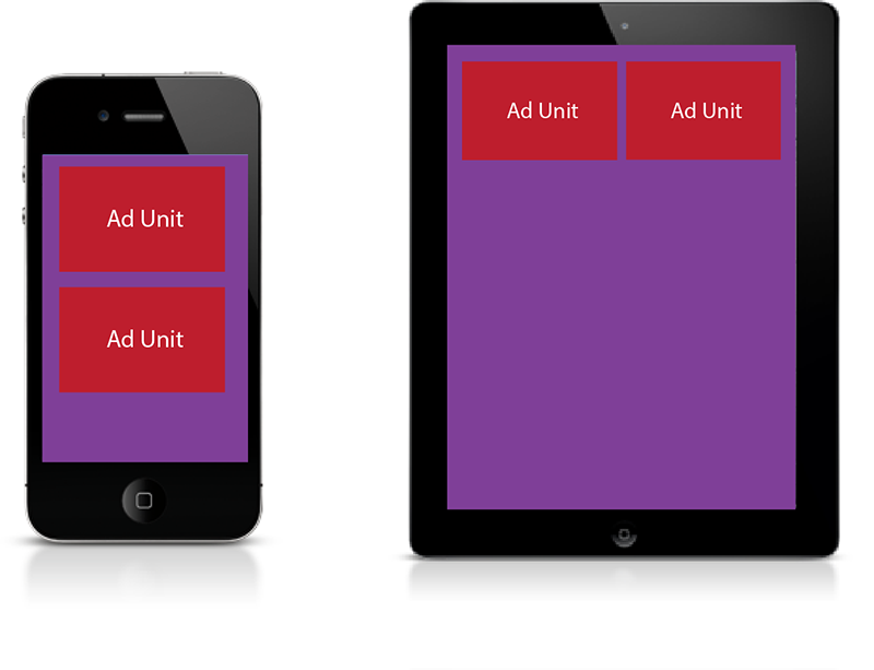 The first rule tells the browser to make the ad unit 100% of the width of the screen. When the device is at least 768 pixels wide (the width of an iPad in portrait orientation), we can take advantage of the extra space and put the ads side-by-side. The media query overrides the default and makes the ads 50% of the screen’s width instead. Media queries are the core of responsive design and are the primary tool we use to adapt a layout for different devices.
Just Add JavaScript
But not all APIs are available to media queries, so sometimes we have to get more complex. One of the best tools in our interface-tailoring arsenal is a JavaScript library called Modernizr.
Modernizr, an open source, community project developed by some of the brightest minds in web development, is basically a long list of tests that query the web APIs and return a set of yes/no answers. Modernizr detects support for more than 250 features like whether a device can play videos natively, load custom fonts, and whether cookies are enabled.
Surprisingly, there is no API that classifies devices by form factor—desktop vs. laptop vs. tablet vs. phone. One criteria we’ve used in the past is the “touch” test. Before the iPhone, mobile browsers treated touches as virtual mouse clicks. Apple developers created a new touch-specific API and released it into the open-source Webkit browser engine. The new API supported up to ten fingers simultaneously and opened the way for swipes, pinches, zooms, and other gestures on the web.
Touch screens on PCs were so rare, and so primitive, that browser makers saw little reason to support the new API. This made the touch API a great litmus test: if a device supported touch events, it must be a phone. Then came tablets, which feature high-end touch screens and support the touch API. Things got blurrier, but it was still possible to distinguish “mobile” and “desktop.”
Nowadays, touch screens are common on PCs of all sizes and “2-in-1” or “convertible” laptops can act as a tablet or a PC, depending on whether the keyboard is attached. Nearly all modern browsers support the touch API, and some browsers claim to support touch events even when the touch screen is disabled. The test that served us reliably is no longer a useful distinction, and even the geniuses at Modernizr have thrown up their hands in defeat.
All In The Headers
So we’ve exhausted all the information we can get by asking the browser, and we still can’t answer our question. To be fair, we don’t have to go any further. We could cut our losses, make some assumptions, and probably be right most of the time.
We can guess that a “phone” is a device with a screen less than 680 pixels wide (smaller than the smallest iPad) and supports the touch API. That should match most of the smartphones on the market, and exclude most of the tablets. This type of educated guessing is called the “duck test,” after the old adage: If it looks like a duck, swims like a duck, and quacks like a duck, then it probably is a duck.
Now, let’s consider the iPod.
Remember the iPod? You probably had one. If you have kids, maybe they still do. Apple sold 14 million units as recently as 2014! The current-generation iPod Touch is basically an iPhone without the phone. It runs all your favorite iOS apps and can connect to WiFi to browse the web. It passes our duck test with flying colors: It’s got a small, phone-sized screen, it supports the touch API; it does everything except for the one thing we really want it to: make phone calls!
Fortunately, we have one last source of information at our disposal, and it’s one that’s been around for a long time: HTTP Headers.
Hypertext transfer protocol (HTTP) is the language that browsers use to communicate with web servers. When the browser asks for a page, it passes along extra packets of information called “headers.” One of these packets is the User Agent String, a series of encoded words and numbers that uniquely identifies the device making the request. The user agent string on an iPhone looks something like this:
Mozilla/5.0 (iPhone; CPU iPhone OS 9_1 like Mac OS X) AppleWebKit/601.1.46 (KHTML, like Gecko) Version/9.0 Mobile/13B143 Safari/601.1
This may look like gibberish, but there are reams of information here if you know how to parse it. Here’s a breakdown (some portions courtesy of useragentstring.com):
| Mozilla/5.0 | Claims to be a Mozilla based user agent, which is only true for Gecko browsers like Firefox and Netscape. For all other user agents, it means ‘Mozilla-compatible.’ In modern browsers, this is only used for historical reasons. It has no real meaning anymore. |
| iPhone | Device name. |
| CPU iPhone OS 9_1 like Mac OS X | Operating System is iPhone OS, version 9.1, based on Mac OS X. |
| AppleWebKit | WebKit is a well-known set of core libraries for displaying web content. |
| 601.1.46 | WebKit version number. |
| KHTML, like Gecko | Another bit of historical fluff. KHTML was an open source HTML layout library that formed the core of Apple’s Safari-browser. Gecko is the Mozilla layout library, so “like Gecko” again means Mozilla-compatible. |
| Version/9.0 | Safari Version number. |
| Mobile | This is a mobile device. (Finally, we’re getting somewhere!) |
| 13B143 | The iPhone firmware version. |
| Safari/601.1 | The Safari build number, useful mainly to browser developers for debugging. |
Now at least we know this is a mobile device, but we don’t know whether it’s a phone. Unfortunately for developers, there is no real standard for user-agent strings; manufacturers can report whatever they want, and routinely impersonate other browsers for compatibility reasons.
Making decisions based on the user-agent string is called “user-agent sniffing” and is generally considered harmful. Sniffing for specific pieces of software, like “Mozilla” or “WebKit,” or certain version numbers, is error-prone at best. As new devices and software versions are released, old code will fail to detect them unless it’s constantly updated.
Fortunately, there is a niche service industry that specializes in cataloging and classifying devices by their user agent strings. Products like WURFL, Device Atlas, and Handset Detection accept a user-agent string as input and return a set of useful information. Passed the user-agent string for an iPhone, WURFL tells us the following:
| is_mobile | true |
| complete_device_name | Apple iPhone 6 Plus |
| form_factor | Smartphone |
Meanwhile, the tricky iPod Touch returns this:
| is_mobile | true |
| complete_device_name | Apple iPod Touch Gen 5 |
| form_factor | Other Mobile |
By comparing the form_factor property, we can finally, reliably distinguish between a phone and a phone-like impostor! Using a service like WURFL lets us abstract away the responsibility of maintaining and updating the device database. Actual humans evaluate every new device that comes on the market and classify them accordingly.
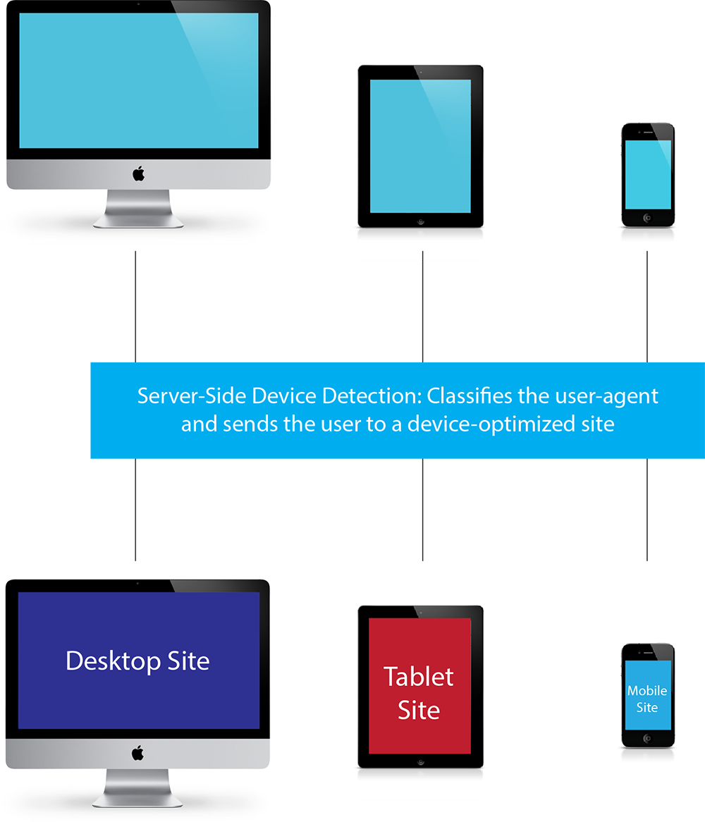
Right about now you might be saying: “So what, Dave? I’ve heard this all before.” It’s true that this approach, called adaptive design, was very popular in the late ‘aughts, just before the responsive revolution, but there’s a major difference between now and then. In 2010, we sniffed user agent strings to classify devices as PCs, tablets, or phones, and then served up “device-optimized” sites. Often the “tablet” and “mobile” sites were stripped-down versions of the desktop site with limited functionality, and the need to maintain multiple codebases was a maintenance headache.
2010: Device Detection and Device-Optimized Sites
2016: Responsive Design + Adaptive Optimizations
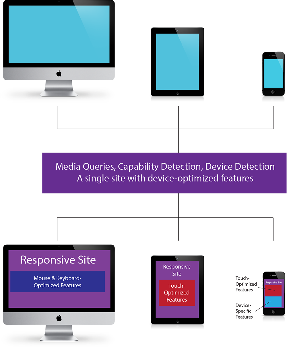
Now, responsive design allows us to have a single site for all devices. We use media queries to do the heavy lifting of transforming the layout to fit the screen. API queries with Modernizr help us tailor the interface further, and just occasionally, a dash of device detection to fix a tricky edge case.
Hopefully this journey through our development process has been enlightening. Designing sites for the wide range of phones, tablets, and other devices is rarely easy, and sometimes frustrating, but who doesn’t love a challenge?


