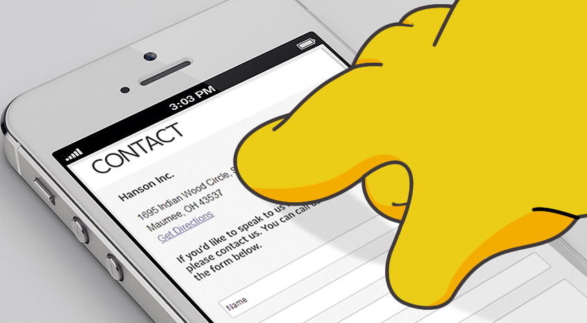
On Mobile Forms and Homer Simpson Fingers
There’s an old episode of The Simpsons where Homer, working from home, tries to call the nuclear plant to warn about a meltdown. As he dials, he hears the following recording: “The fingers you have used to dial are too fat. To obtain a special dialing wand, please mash the keypad with your palm now.”
Those of us without tiny fingers know Homer’s pain all too well. Despite a gradual increase in screen sizes, typing and filling out forms on a smartphone is no picnic. According to a study conducted by Blink UX, users took over 100 seconds to type a moderately-long message on their preferred mobile device. On an unfamiliar device it took even longer.
Designing a successful mobile signup is about removing as much data entry as possible, and optimizing the display and usability of what remains. Below we’ll explore some techniques to engage users while minimizing the need for a special dialing wand.
Getting to know you…gradually
The best form field is the one you don’t have to fill out. Take a look at your signup form and ask yourself: “Do I really need all this information about every new user of my site?” Chances are you only need a few pieces of information to create a unique profile you can build on later.
Enter gradual engagement. In a nutshell, gradual engagement is allowing users to try out your product by giving you a little information, or no information at all. If they like what you have enough to stick around, you can collect more information a little at a time.
Example: Ancestry.com
Ancestry only requires three things: my first name, last name, and age. There are other fields, but they’re optional or have a default value. Most importantly, this “signup form” isn’t a roadblock. It’s actually the first step in researching my family tree.

On the next screen I see some search results, and I’m prompted for an email address. Instead of making me type in a username and password, they’ll email me one. I’m engaged and using the site and I’ve only typed in my name, email and age. If the content is good enough (and if you’ve used Ancestry, you’ll know those little green leaves are addictive) they’ll have much more of my information shortly.

Can’t someone else do it?
Chances are, your users already trust someone on the web with their information. Services like Facebook Connect can provide that information to your site. Over 1 billion people are on Facebook, and hundreds of millions of them (150+ million according to Luke Wroblewski) use the Facebook platform to log in to other sites every month. Those people have already built extensive profiles containing personal information. You can tap into that information (responsibly, of course) by allowing users to sign up and log into your site with their Facebook account. Facebook Connect SDKs are available for the web, iOS and Android, and now that Facebook is integrated fully into iOS 6, many users will never even see a login prompt.
If Facebook isn’t your cup of tea, Twitter, Mozilla, Microsoft and Google all offer similar services (Sign in with Twitter, Mozilla Persona, Windows Live Connect and Google+ Sign-In).
Using a third party gives you more than a way to bypass a login screen: if your site has social or sharing features, you can take advantage of the profiles your users have built. Not everyone will be comfortable with you sharing lots of information on their behalf, so be upfront about what your site will share and give the user a way to turn off social features. Better still, give your users the ability to register the old-fashioned way if they choose.
So it’s come to this
After you create a grand, innovative gradual engagement strategy and connect your users to their preferred social graph, there are likely to be a few form fields left over. Use the tips below to optimize your forms for the digitally rotund.
Start with the right viewport
If your page’s viewport is too wide (or worse, not set), your users will have to pinch and zoom before they even begin typing. If your site is responsive, setting the viewport to the device’s native width (<meta name=”viewport” content=”width=device-width” />) will ensure the best display. If you have a standard mobile site, make sure the viewport is the width of your layout (usually about 320 pixels). Use CSS to give form inputs some extra padding. A big click area means happy fingers.

Put your form labels above the fields
The battle over the “correct” placement of form labels (left or top) has raged in web dev circles for years, but on mobile the choice is clear. When you put labels to the left, the auto-zoom feature cuts off the text. Labels above the field are always in view.

Use the right keyboard
In Blink UX’s study, users struggled the most with capital letters, numbers, and punctuation/special characters, because these are all buried in submenus when using the default keyboard.
HTML5 introduced new text input types including number, telephone, email, and URL. These input types tell the smartphone to use a different keyboard layout specialized for the type of input at hand. You can also specify a pattern attribute on your inputs to restrict the values users can enter (and in some cases, narrow the keyboard further).

Turn off autocapitalize and autocorrect when appropriate
Smartphones try to make typing faster by capitalizing and completing common words, and fixing spelling mistakes. Autocorrection can slow down typing of proper names, usernames, addresses, and other non-dictionary words. Fortunately, you can control this behavior by adding autocapitalize and autocorrect attributes to your inputs.

As of iOS 5.0, autocapitalize=”sentences”, autocapitalize=”words” and autocapitalize=”characters” are supported. Autocapitalize=”on” is the same as autocapitalize=”sentences”.
On Android, typing suggestions show up in a bar above the keyboard, so these options have no effect on that platform.
So there you have it.
Engage gradually. Ask somebody else for user information. And design fat-finger-friendly forms. These three strategies can take the pain out of filling out mobile forms and help turn browsers into engaged users.
The Homer Simpsons of the world will thank you.

