Developing Custom Apple Watch Apps: A Hanson Demo
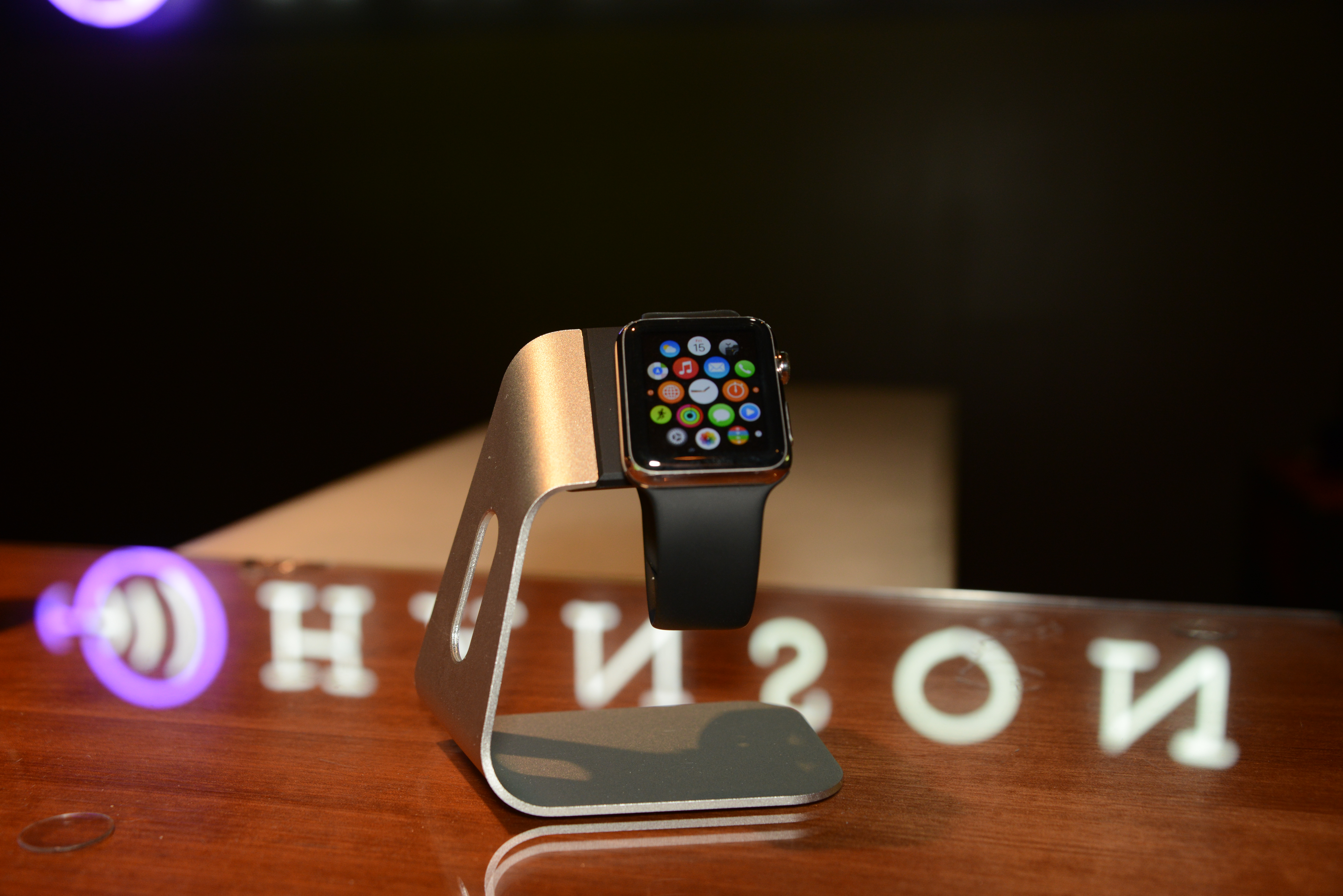
You already know that the Apple Watch is Apple’s entry into the blossoming smartwatch and wearable category. It works like this: the computer-on-your-wrist has a symbiotic relationship with your iPhone. Health data read from the watch sensors flows to your phone’s activity tracker. Incoming notifications for apps on your phone are routed to your watch, where a click glance removes the need to pull the phone from your pocket.
How do you create custom watch apps that enhance existing iPhone apps? Let’s walk through the process.
Watch Apps vs. Normal Apps
First, we should discuss the difference between watch apps and normal apps and how they work together. For users of custom apps, the process of installing and using watch apps is easy. You will either get an update or download a new app from the App Store on your iPhone and then select to install the watch app on your watch. The watch app and iPhone app will appear to seamlessly communicate. What happens behind the scenes is a little more complicated.
The watch is extremely constrained by the battery and computing power compared to the iPhone. This is the main motivation for how the watch and iPhone communicate. When you run a custom app on your watch, you are in fact running an app on your iPhone with the display on the watch. The only part of your watch app that gets put on the watch are the graphics of the interface. The code of the custom watch app runs in the background on the iPhone. Thus, the watch app that runs in the background is separate from the normal iPhone app since the user will interact with it via the watch without the full iPhone app necessarily running.
The existing iPhone app will continue to do the heavy lifting. Maybe you’re using the Twitter app that pulls in new tweets or the Delta Air Lines app that allows you to see your current flights. The watch app running in the background on the iPhone can share that same data and display information to the watch. But keep in mind there are some gotchas with regard to communication between the two. Essentially, Apple has framed things such that the iPhone app can’t directly message something to the watch app. They can share data, and the watch app can talk to the iPhone app, but the iPhone app can’t control the experience of the watch app. It’s probably for the best that a device with a small interface and limited resources only has one thing telling it what to do: You.
Kicking the Tires: Trying Out the Developers Kit
Now let’s put this to use. Hanson maintains a (virtual) shelf of internal apps in order to facilitate engineer training and education. Any developer looking to learn or tinker with an actual app can pull from our source code control system and try things out. I landed on adding Apple Watch capabilities to our internal Directory app. The Directory app pulls employee contact information from our directory server and displays it along with the employee’s picture.
The use case we’ve identified is finding out an employee’s phone extension. Often you are calling someone at their desk but don’t want to pull out your mobile phone to lookup their extension. Having the phone extension on your wrist would be perfect for such a situation. Let’s look at what interactions we can take advantage of.
- The App Interface
The main watch app is activated by the user selecting the icon on the home screen of the watch, just like on iPhones and iPads. This part of a watch app offers full use of the watch developers kit (see Glances and Notifications below for other interfaces).
Planning and designing your watch app interface will start with some review and consideration of your current app. Think back to custom apps on smartphones distilling down the important features of their desktop application counterparts. A watch app will have that similar distillation. While it’s still early to give a hit list of considerations for everyone, give thought to the limited interactivity of the watch and what information should be pushed to the watch from the phone. Allowing the user to control that flow of information to meet their needs will be a must.
In the case of our Directory app, the existing functionality is quite simple. We start with a scrolling list of all employees. When an employee is selected, we see all the contact details and a picture. A button is also available to refresh the list from the server. Turning to the watch interface, the scrolling list would carry over well as a way to display all the employees. Clicking on an employee can go to a detail view, but we should tailor the data to pertinent information. We obviously want the employee’s name, extension and cell phone, but don’t need address or other information.
One watch feature we can take advantage of here is the force touch menu. When the user presses the watch face harder than usual, a contextual menu can appear. The menu can accommodate up to four options. In our case, we thought that a menu to sort the employees by first name vs. last name provides users a quick way to tailor the list to their preference.
- Glances
A “glance” is a view the user would see if they swiped from the bottom of the watch. It’s similar to the multitasking view of iOS where you double click the home button to see your history of recent apps. The difference, however, is that you can populate this view from your code. It’s a read-only view, though, so no buttons or interactions are allowed, and any touch to the glance will open the full watch app. A perfect use case is the Delta Air Lines app showing your current boarding pass code for scanning.
In our Directory app, we can use the glance to show the last employee viewed. Think of this use case: You need to call a fellow employee but find that he/she is on the phone already. You go back to work and want to call again, but forgot the extension. A quick swipe to the glance, and the information is at your fingertips again.
When our user is browsing the Directory watch app and selects the details of an employee, we will store that information. When the glance interface is called, we will look at the last viewed information and display that. If the user taps the glance, our full watch app will get opened and will get flagged as having come from the glance. If we launch the app from the glance, we can show that last selected employee detail view for continuity.
- Notifications
The last type of interaction the Apple Watch platform provides is for notifications. Notifications have been on iOS for many years as a way to bring alerts to users. This concept is expanded with the Apple Watch. While a basic notification could appear on your watch with the app’s icon and a small piece of text, more advance notifications are possible that allow the user to react to the information.
What Apple terms “long-look notifications” allow the developer to create their own display of information and customize buttons to handle responding to the notification. The default Calendar app with a meeting invite notification showing buttons for Accept, Maybe or Decline is a great example. The user also has the option of opening the watch app from the notification.
With our Directory app working with a fairly static set of data, we don’t have a specific need for notifications. Stretch goals of integrating the Directory app with our office bluetooth beacons or Slack messaging system will wait for another time and another blog article.
- Other Technology
The Apple Watch features several other technologies that developers don’t have access to—at least not yet. While custom apps can use dictation in lieu of typing for text input on the watch, there is no raw audio input or output available. The Taptic Engine in the watch that produces physical pulses on the user’s wrist is also not something developers can use in custom apps. Lastly, while heart rate information transfers from the watch to the phone and would be available via HealthKit (the iPhone system storing your health data), there is no way to read the heart rate in real time. Developers will certainly make a plea to gain access to these other technologies with the hope that Apple allows access after all.
Test and Ship
While every new device and developer kit requires some learning and testing the boundaries, the hardest part of Apple Watch development might just be finding enough people to test your app. The development kit has been released for quite a while, but the device rollout is constrained. All the above development was done in the simulator while we waited for devices. Now that devices are in, I just need to convince users to stop using all the other apps and test mine!


