Through the Looking Glass: Developing Hanson’s First Glass App
My colleague Joel Lanciaux and I got the opportunity to develop Hanson’s first Google Glass app. So we thought we’d take a few minutes to talk about what we learned from the experience. What follows is a loosely-edited transcript of our conversation.
Rick: You start.
Joel: OK. Well, at Hanson, we’re always looking at what’s new – testing new devices and the ways people use them in different environments. So as soon as we got our hands on Google Glass, we had to develop an app for it.
Rick: You and I worked on the app together, and I think we had a pretty similar take on what it’s like to develop for Glass, and on the device itself.
Joel: I think we’d agree that it’s really cool, but not ready for public consumption…yet.
Rick: Yeah. What Glass has had going for it is that it’s rare. Even though we’re hearing more about it these days, for some people, seeing it in the wild is still like seeing a unicorn. But when you’re playing with it every day, like we were in developing our app, it loses some of its sparkle.
Joel: Google Glass kind-of rides the line between Ferrari and fanny-pack. If seen in public with it, you’re either going to get envious stares or eye-rolling snickers.
Rick: Exactly. So to talk about what we learned from the process, maybe we should start by describing the app we developed.
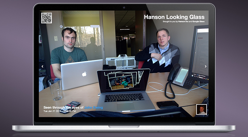
Joel: We called it the Hanson Looking Glass because it lets the wearer send a photo of what he or she is seeing to a website, where other people can see through their eyes. It was a fun project that encouraged everyone at Hanson to try out our new toy and share a little bit of their day.
Rick: It’s a pretty basic app, with two primary activities: it lets you select your name from the company directory, and then take photos and upload them to our photostream website.
Even though it only does two things, it requires at least a two-minute walkthrough to get someone to use it properly. This is mainly because of the Glass UI, which right now is completely unintuitive. But this is probably because it’s the first device of its kind that most people have used, and it will become more intuitive over time.
Joel: Everyone is still figuring out the “right” UI. Coming from a web and mobile world where UI/UX patterns have been refined for decades, it’s pretty exciting heading into the Wild West that is Google Glass.
A lot of effort has been applied towards this, and Google even provides developers with a good amount of documentation, but it’s still cumbersome to use the small, touch-sensitive rectangle, and voice commands are effectively the only input methods available.
Rick: I like the option of opening an activity directly with a voice command. But to develop on the Glass, you are constantly talking to it, testing the same commands over and over again; the words start to lose their meaning. And in an office with open cubicles, you get a lot of weird looks.
Joel: It’s horrible.
Rick: Ha. But for those who haven’t used Glass, here’s how it works.
Before giving a voice command, you must first turn on the screen. This is done by either touching the touchpad on the side of the device (near your temple), or nodding your head.
After the screen is on, you must be at the home screen that says “ok glass.” If you are at the news screen or looking at photos or inside an app, you have to swipe until you get back home. Once you are back at the “ok glass” screen, you can say your voice command, but every voice command must be prefaced with “ok glass.”
Our app’s voice command is “share with Hanson.” I don’t remember how many times during development that I quietly said “ok glass: share with Hanson,” but it was definitely too many.
Joel: Yeah, it’s not the best input for everything. It makes browsing your Twitter feed or attempting to send an email to a friend a little ridiculous. But it’s perfect for applications that don’t require a whole lot of interaction.
A great example of this is Allthecook’s Glassware app, which provides an amazingly simple way to navigate through steps or reference measurements of a recipe, leaving your hands free to do the work.
Rick: So it definitely has a lot of potential. But I can’t see it taking off until 1) the interface is made easier and more intuitive, and 2) the device becomes much less visible, integrated into glasses (without a chunky block on the side) or contact lenses.
Joel: Agreed. I don’t believe that the Explorer version and its “design” will be what launches the platform to mass consumer use. As much as I wanted it to when Google Glass was initially announced, it never stopped me from reaching for my iPhone when performing a task that was able to be accomplished on the Glass. The Glass doesn’t come anywhere near obsoleting our smart phones.
Rick: Yet.
Joel: Exactly. I’m looking forward to seeing how it and other wearables evolve over the next couple years – and of course excited to keep developing and testing.
Editor’s Note: A few months ago, we invited two local reporters to try on Glass, use our app, and talk to some of our Strategy and Experience people about where Glass and other wearables might be going. The result was this story at the Toledo City Paper.
