The User Experience of Live Events
A few weeks ago, a colleague wrote about how his work as a user experience architect is filtering down into his personal life and changing the way he relates to people. His story demonstrates that UX is not just for web architects and usability testers.
UX is a philosophy. An organizational principle. A customer service promise. It’s the theory around which we design websites and apps and other system interfaces, yes – but also live events.
When we manage and market live events on behalf of our clients, it’s not the technology that drives the primary decisions. It’s the user experience.
- How loud should the audio be? At the decibel where everyone can hear comfortably.
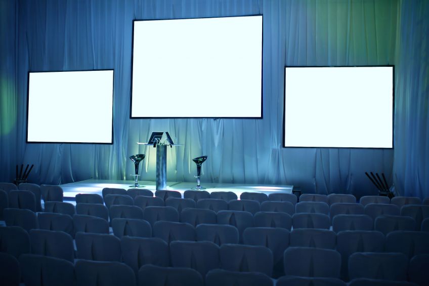
- Where should we place the screens, podiums, and stages? In locations where everyone can see comfortably.
- How warm should the room be? At a temperature where everyone can feel comfortable.
- Where should the cables, cameras, red carpets, banners or potted plants be arranged? In a configuration that allow everyone to navigate the room comfortably.
- Where should signage and directionals go? In easy to follow locations, especially if the venue is new.
- How should we structure the schedule? Decide between workshops and keynotes? Order the slides? In the way that best facilitates the training, motivation or other reason everyone is there.
And we have to make sure that all of these necessary elements don’t get in the way of the attendee’s experience. No one should have to notice or think about them at all – the setup should just work.
In other words, whether it’s the navigation of a website, the interface of a kitchen appliance, or a live event, UX is the key to success.
What unexpected places are you applying user experience principles?


