Easing, Excessiveness, and Pace in Motion Design
As a motion designer, I pay more attention to animation than most people. Among the biggest issues I run across when viewing animation (whether it’s UI or video) are inappropriate easing, movement, and pace. Sometimes designers and artists just forget to ease, or assume that everything on screen needs to be moving at all times, or neglect to allow enough staging for each subject.
Want to improve your animations? Let’s break down these fundamentals of motion design and their significance.
Easing
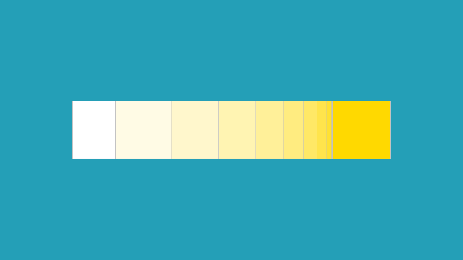
As a principle of animation (slow in and slow out), easing is supremely important throughout any animation. Whether by keyframes, expressions, curves, or code, giving an object time to begin or end its movement allows the viewer to grasp what is happening before the action is in full effect.
Obviously there are many places easing would be out of place (such as heavy objects falling, representing a sort of magnetism, using hold keyframes, etc.) but most volumes intended to look organic or show realism need to be shown gradually beginning their action and, often, gradually ending it. You can take easing to the extreme; for example, having masses take too long to begin moving or letting easing take precedent over the purpose of the animation. It’s important to remember to make lifeless forms move rigidly and organic forms move more fluidly.
A side note about easing: It’s a generally held belief among motion designers that stock easing is the epitome of laziness or carelessness. This is hyperbolic. Sometimes easy eases are perfect, like when you animate opacity. If time constraints prevent you from opening the keyframe velocity or curves editor, sometimes an easy ease is okay.

Excessiveness
Easing isn’t the only place you regularly see excessiveness in animation. You’ll often see user interfaces that animate every rollover and click, or videos with excessive secondary action.
It’s important to be aware of everything within your animation that could distract your viewer or user from their task or from the idea being communicated. I’ve seen many phone app videos that look very pretty and feature wonderful animation, but I realized after closing the video that I didn’t know what had just been advertised to me.
The idea is the most important thing to communicate, regardless of all of the beautiful little things that could be happening in the background.
Pace
You know those commercials with a really sped-up voice describing how “terms and conditions may apply, blah blah blah”? In some ways, having poor pacing in your animation is similar.
Every idea you are trying to communicate needs to be given the proper amount of time, but not so much that viewers/users lose interest. This may come down to personal taste, but in general, edit your pacing to something that feels good to you.
A good rule for text is that it needs to stay on the screen at least long enough for you, the designer, to read it twice. My rule for other animation is that if you hold on something for longer than two seconds, the viewer is probably getting bored or wondering what’s supposed to be happening. Secondary action is a great way to offset slow movements of animation.
Conclusion
These are three simple principles, but they’re important. So moving forward (animation pun!), remember to:
- keep your easing in line with the qualities of the object
- keep a handle on the amount of things that need to be happening at once, and
- adjust the pace of your animation to fit the situation.
With those rules in mind, keep making awesome animation! And always ask people for feedback; a second pair of eyes can reveal things you would never have seen.