Designing an Interactive Experience
Here at Hanson, collaboration and conversation matter. We thrive on working together to produce projects and believe our best work comes from our various disciplines working together.
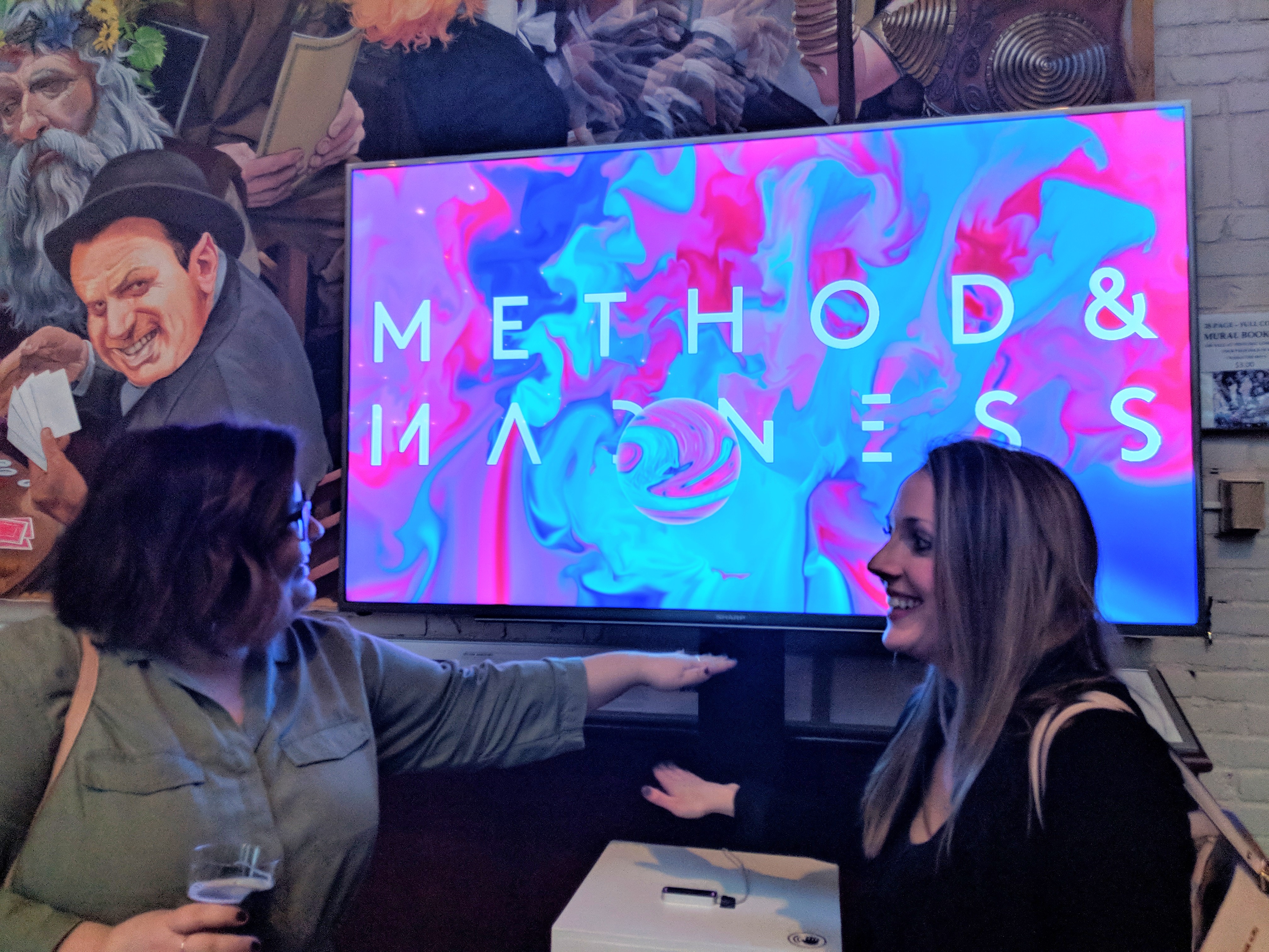
The American Advertising Awards (ADDYs) is the advertising industry’s largest and most representative competition, attracting over 40,000 entries every year in local AdClub competitions. This year, Hanson planned, designed, and executed all of the creative elements for the Toledo chapter’s event, which included print collateral, an introduction video, and the development of an interactive digital experience using virtual reality hardware for event attendees to interact with a simple wave of a hand.
Today, we’re sitting down with Visual Designer Chris Hatfield and Software Architect David Williams to talk about how they and other team members worked together to develop the interactive experience that was such a hit at the event.
Sally: David, could you briefly describe what we built and how it worked?
David: We made an interactive display based on the awesome marbling visuals and logo that Chris designed. In front of the display is a podium with a Leap Motion sensor attached to it, which allows us to track the positions and poses of any hands that wave above it. As people walked by, they could wave their hands over the podium to directly interact with a simulated fluid on the screen, swirling the colors from the marbling imagery around, into, and out of the logo text. We built the scene using Unreal Engine software, which has great support for the Leap Motion tracker.
Sally: When you first began working on this project, what were you most excited about?
Chris: I knew that we could make something simple to use but fun and engaging, and I knew we could use the basic elements of the event branding, but I didn’t quite know what David could put together. That was the most exciting part for me, because I love the excitement of collaborating and having that freedom and space to let the idea be translated. Sometimes there are really stringent guides or standards to a collaboration and they dictate what can or can’t be done, but here it was really just having fun and asking ourselves “what can we come up with in this timeframe with this short list of tools?” and I think that’s why we were able to create a strong moment.
David: It was pretty easy to get pumped seeing the visual materials Chris had put together and hearing what he had in mind. I also love any chance to work with real-time technology, being a game developer in my spare time.
Sally: What was unique about this project? How was it different from other projects you typically work on?
Chris: I work on everything from UX to Motion, so I’m somewhat used to having interfaces come to life. The great part here was that we were able to focus on providing a single specific moment of delight.
David: End-to-end, from software to hardware, this was very out of the ordinary for me. I’ve had some experience with motion tracking, being a hobbyist VR game developer, but working with a fluid simulation was new to me and combining the two was a lot of fun.
Sally: Tell us about the process you followed to bring the idea to life.
David: Tons of experimentation and iteration!
Chris: I love how specifically developers collaborate with the repurposing of code, it’s a pretty sublime example of how creatives are constantly interacting with a creative exchange by authoring content and putting it into the world. You join the conversation and those ideas spread around and great ones or particularly useful ones stick around.
Sometimes ideas show up as a connect-the-dots scenario. The dots appear based on experience and exposure, and how we connect them and make the final form appear comes from design chops, technical skills and sometimes a healthy dose of intuition. Other times ideas appear almost fully formed. Knowing the feeling, the general attitude or energy of the piece, what kind of things we should be thinking or feeling when viewing the piece, all that serves as a wayfinding guide to what we could or might be seeing aesthetically and experiencing functionally. Often, it all comes from a combination of those approaches, and probably a few others as well.
Sally: Describe the collaboration between design and engineering that took place during this project.
Chris: The basic building blocks of the branding were swirling colors, liquids, things of that nature. That just begs to be played with in an interactive sense. I knew David would have great ideas about what we could and could not do within our scope so I really just wanted to keep the channel open and let whatever gets made get made, provided it hit some basic targets. One was that it be interactive to attendees, preferably without touch. Another was that it feel high fidelity enough that it could feel finished even though the idea might be simple. So that meant simulations had to be high quality as opposed to super low poly stuff.
David: As Chris said, there was a lot undefined here and it was fun to let loose and try a variety of approaches. The simulation absolutely wouldn’t have worked without having strong materials to start from.
Sally: Were there any challenges you needed to overcome?
Chris: Mostly time, really. But I knew that once we had the leap motion functioning and the basics of the simulation in place, that David’s instincts would get us the rest of the way. In the initial version the colors ran together and became super muddy and eventually grey, which was too real. David’s solution was to reference the color of the underlying imagery based on the luma of the logo so we would continually get new colors into the space and push out the greys.
David: Outside of the time factor, there were some unique challenges in untangling the complexity of the fluid simulation in order to fit our needs. The color blending example Chris gave is a good one, and getting the indicators to show up correctly and interact with the user’s hands properly was another that comes to mind.
Sally: What was the most rewarding part about this experience?
Chris: I think the best part was seeing people really enjoying it and how their faces lit up when they were having fun. There is this really great almost magical feeling when you use technology to allow someone to do something unexpected. Something as simple as waving your hand in the air with a great motion tracking experience lets guests, even for a split second, feel like they have amazing control of this virtual experience. I love that part the most. But I’d say a close second would be watching a group of people who are good at their game get to turn on and experiment a little bit and have fun.
David: It was great to collaborate with Chris on this and see how his vision turned a tech demo into something so engaging. Outside of that, definitely seeing a crowd playing with it for the first time was the best part. It was really satisfying to see everyone’s initial surprised reactions, and later how much trouble some people had walking away from it!
