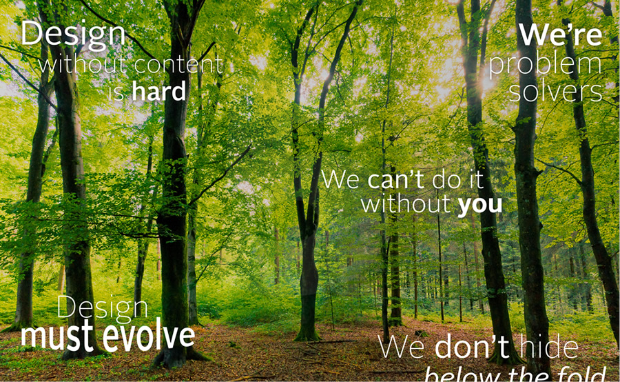
5 Things Your Interactive Designer Wants You to Know
As an interactive designer, I work with clients everyday, sorting out the nitty gritty of how to present information on a page in order to sell a product or service. It’s a privilege to collaborate on client projects, and it’s rewarding. But sometimes designers are misunderstood, and we don’t always have the opportunity to explain why and how we do what we do. So if you’ve ever wondered what your designer was thinking, here are five possibilities. Consider this an opportunity to walk in our shoes—it may help you see future projects from another angle.
1. Design without content is hard—and doesn’t serve your product.
Content—or the lack thereof—is an issue common to many projects. A picture may be worth a thousand words, but if we don’t know up front what those words are, it’s hard to paint that picture. That’s why designers fear the phrase “we’ll add the content later.”
We’re considering many different principles while working through a design: balance, rhythm, proportion, dominance, unity. When these elements live together in harmony, a design breathes the product’s message. Good content helps us hone in on the specifics of each of these principles. For example, knowing that a product should feel soft vs. hard might instantly rule out a harsh red in favor of a gentler lavender.
Every visual element in a design should serve a purpose. Without words to define that purpose, we are left pasting pretty pictures on a page that may not reflect the overall message. Just as Monet found his inspiration in nature, putting himself in the environment he was painting in order to find the best view of that inspiration, your designer needs that inspirational content at the outset.
2. We don’t hide below the fold—but we do prioritize content.
“The fold” goes back to newspapers, where front page content lives both above and below the fold. The assumption here is that content above the fold is more likely to get exposure to readers because it’s the first thing they see. Many debate whether the same is true for webpages. Those who argue that it’s the same try to shove everything they deem important at the top of the page.
As an interactive designer, I disagree with this point of view, and instead consider the page as a whole. We have to assume that consumers know they can scroll down the page, or else the whole internet fails to work in its current form. However, I can’t deny that what a user sees first will probably have the most impact. So the “fold debate” isn’t the true issue. What we really need to talk about is content priority.
What piece of content should go first? Second? Third? If you give your designer 8 sections of extremely important marketing copy, some of it is going to fall below the fold. So instead of telling him or her to find a way to fit it all above the fold, consider it an opportunity to tighten your copy and prioritize it. Not only will your designer thank you, but you’ll also both be better equipped to tell the best story about your product.
3. We can’t do it without you—and we don’t want to.
Your project starts and ends with you. You bring us the product or concept and we apply our skills and training to it, giving it digital life. But then we give it back to you to review, and we crave your feedback. Honestly. We can and will consume as much knowledge about your brand and product as possible, but you will always be the expert at your product. That may seem obvious, but maybe it’s a good reminder.
We need and want you to be involved the whole way. We’re not being lazy; we’re being collaborative. Whether it’s a list of assets to provide or a chunk of copy to review, your feedback helps us craft the best solution.
Some of the most satisfying work I have done as a designer has been on projects where the client was deeply involved; conversely, the least satisfying projects tend to be those lacking in client involvement. So please, dig in with us.
4. At heart, we’re problem solvers—not collage artists.
Part of our job as designers is to take copy, pictures, and video and lay them out on a page until we’re happy with the position, but usually our thoughts go way deeper than that. We’re thinking: “Where should this button go? How can I make this feel clickable? What symbol can I use to represent this idea?” Design isn’t just about putting things in a comfortable layout; it’s about solving problems.
It’s fairly easy to tell when the problem isn’t solved. We’ve all been on a webpage or used an application where we feel lost or we don’t know what to click on next. This is what makes technology seem hard to use. Usually the issue is no fault of the user but of the design. So next time you use a website or application and it just works, give props to the designer—because a lot of thought probably went into it.
And if you find something that doesn’t work, don’t blame yourself. Tell one of those problem solvers and let them know it might be worth taking a deeper look. They’ll relish the opportunity.
5. Your design must evolve—and your designer is ready to assist.
A change in thinking is in order. Five years ago, we could combine solid marketing statements, a couple of products and a logo, and bam, we’ve got a killer website. But today, a website is no longer a static page that lives on the web. It’s an organic place where customers come to connect with your product in any way they wish. They expect to be able to learn everything about your product through pictures, videos, and customer reviews. They expect to be able to share your product and ask their friends what they think. And they expect to be able to do it all on any device that connects to the internet.
And what about tomorrow? New devices to consume your content come out weekly. New social services to share your content appear monthly. These are new opportunities to connect with your customers—and your design must be able to accommodate them.
That’s why a pixel perfect fixed size website is no longer adequate. Instead, we need to provide ways for the site to easily transform and adapt. Responsive design is the beginning of this process. It might not be perfect, but it’s a step in the right direction. And your designer would love to help you meet this challenge for the good of your brand.
I can’t speak for every designer, but chances are, these 5 thoughts have crossed your designer’s mind at one time or another. Hopefully walking this mile in his shoes has been enlightening and maybe even encouraging. Here’s to great collaboration with your interactive designer!

