The Apple Watch: First Thoughts From A Curious User
I received a Fitbit Charge for Christmas last year and really liked the device, and I haven’t worn a watch daily for at least a decade because cell phones have made it feel redundant. So when the Apple Watch was announced, I thought it looked interesting but it wasn’t something that really excited me. I couldn’t immediately see a good use case for it. But I’ve been trying out an Apple Watch now for a couple of months and have some initial reactions I thought I’d share, especially about how it compares to the Fitbit and also a few of the apps I’ve found interesting.
But first, a general overview of the watch.
How It Feels and Works
I ended up with the 42mm watch model with the black leather loop band. I haven’t tried on the 38mm model, but the larger model feels comfortable on my wrist.
Regardless of the screen size, though, hitting those tiny app circles on the watch face can be difficult and I’ve launched the wrong one on several occasions. In true man fashion, I didn’t look at the manual at all and instead spent time poking around with the buttons and figuring out what they did and how to navigate the device.
The ability for the screen to turn on when you raise it and turn off again when you drop your arm works really well and feels natural.
The screen is very responsive and although the new force touch gesture isn’t immediately intuitive, you quickly get accustomed to it and it works well. There isn’t any indication that a force touch gesture is available on a screen though, so it can feel a little trial and error with some functionality. In general, it seems like if there is expected functionality but you don’t see a clear button on the screen to do it, you should try a force touch to bring up other options.
For example, by pressing a little harder on the main watch screen, I was presented with options to customize the clock display. There are 10 basic options to choose from, most of which allow you to customize the information displayed to a certain extent. I ended up settling on the Modular option that allowed me to display:
- The time
- Current day/date
- My next calendar event for the day
- Current temp
- Current activity for the day
- Remaining battery
This has worked well for me so far as a quick overview whenever I glance at my wrist, and each item is also clickable to launch its respective app.
I explored the glances briefly by swiping up on the main watch screen, but I didn’t find any useful information there that wasn’t already displayed on my watch face. The Apple Watch app on the iPhone allows you to customize what glances are available, so over time I may find apps that will make sense to display here.
Apple Watch vs. Fitbit
In hindsight, after using the watch for a week, I think I should have opted for the sport model. This is part of what I struggled with when trying to wrap my head around the idea of the Apple Watch. Apple hypes the activity tracker and health monitor capabilities of the watch, but they sell a design and bands that feel completely inappropriate for a lot of physical activity.
Coming from the Fitbit Charge, the Apple Watch took some time before I was used to the feel of it and I was constantly adjusting the band to find a balance that wasn’t too loose or too tight on my wrist.
Also, because the Fitbit is lighter and doesn’t have the sensors so it can be worn looser on the wrist, I had gotten used to sleeping with it on and using the vibration alarm to wake me in the morning. I tried to sleep with the Apple Watch on and use its alarm, but it just felt too heavy and wasn’t comfortable.
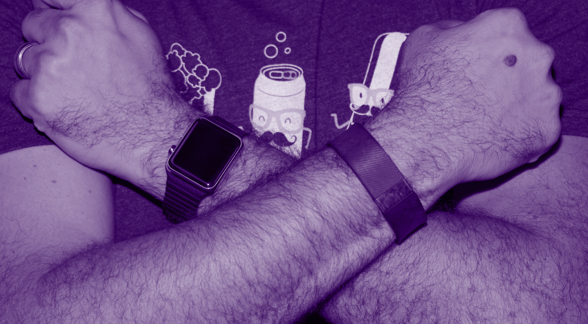
In fact, I was missing my Fitbit so much that I started wearing both of them on my wrist for a little while giving me the complete über-tech-dork-hipster look. On the upside, this allowed me to compare the two of them side-by-side as health tracking devices.
With the Fitbit, I had become accustomed to looking at steps recorded as my main indicator of whether I was being a lazy slob or not. So the first day I wore them both, I compared step counts on both devices.
(Note: the Apple Watch’s health metrics use active calories burned, minutes of exercise, and standing for at least one minute of each hour of the day as the main metrics reported, but you can still get to steps counted in the deeper data recorded.)
| Fitbit Charge | Apple Watch | |||
| Steps | Total Calories | Steps | Total Calories | |
| M | 12937 | 3046 | 10753 | 3347 |
| T | 10037 | 2773 | 8921 | 3384 |
| W | 7512 | 2602 | 6457 | 3136 |
| T | 10047 | 2740 | 6753 | 3271 |
| F | 5523 | 2442 | 4907 | 3107 |
| S | 6973 | 2596 | 5658 | 3123 |
| S | 7979 | 2572 | 7245 | 3334 |
Comparing the numbers, the Apple Watch was consistently recording fewer steps—interestingly, it was also consistently recording more total calories burned per day than the Fitbit.
Step counters attached to your wrist are generally looked at as less accurate than traditional belt-attached pedometers, so it’s difficult to determine which might be closer to the truth looking at a full day’s numbers. Therefore, I tried some shorter isolated activities to get a better sense of how actual steps were tracking.
| Fitbit Charge | Apple Watch |
| Activity: Walking 85 steps to a meeting | |
| 75 steps | 90 steps |
| Activity: Sitting in meeting for an hour | |
| 66 steps | 40 steps |
| Activity: Walking 200 steps back to office the long way | |
| 224 steps | 137 steps |
| Activity: Shaking my arm back and forth for 1 minute while sitting down | |
| 180 steps | 235 steps |
One thing to note with these isolated counts is that when reviewing the Apple Watch counts, there were noticeable delays until the count updated, so it’s possible that some of the steps recorded didn’t show up until after I checked the count.
Looking at the numbers, neither device would seem to be overly accurate from a pure steps-recorded standpoint, but that’s probably okay because in reality, steps really aren’t the end goal. Both products are attempts to gamify leading a more active lifestyle by guiding you to make small adjustments in your day-to-day life.
When you look at it from that perspective, the metrics that the Apple Watch is reporting on start to make more sense to me. Tracking calories burned while actively moving, minutes per day that are spent exercising, and not sitting for too long of a period without a break seem like targets aimed at an overall healthier day than simply steps taken—which could be achieved by sitting at a desk for 8 hours and then walking for a few miles at home.
After a week of use, the move and stand rings became fairly easy to achieve consistently, but there are days where that damn green circle doesn’t seem to want to move even if I go for a quick jog.
Day-To-Day Tech
Aside from the activity tracking aspect of the Apple Watch, there have been a couple of other instances where the core watch functionality started to feel like a useful addition to day-to-day tech. The slight vibration from the watch when using the maps app to indicate an approaching turn was a nice indicator without me having to glance down at my phone, and using the timer function on the watch when grilling out over the holiday weekend was convenient and much easier to use in the flow of cooking than my phone or a separate timer.
Would these nice touches and conveniences make me say that the Apple Watch is a must-have device and worth the purchase price at this point? Nope, but I can start to see how the right apps could continue to add value to the platform and start to make sense.
I had recently started using http://tomato-timer.com/ to keep me focused on tasks at hand, so I tried out two Pomodoro timer apps that support the Apple Watch to see how they worked. Pomodoro Plus has a very nice design that attracted me at first, and works well if you’re just looking for a strict timer with metrics and reporting. Focus Watch is a nice option if you have multiple projects as it allows you to create a to do list of tasks on the phone app, then select which task you’re working on. The app will then keep track of how many rounds you’ve worked on the task.
I also recently went golfing for the first time in over 5 years, so I downloaded the GolfLogix app to try out the watch as a digital caddy. The app itself isn’t the greatest from an interface and ease of use perspective, and there were some initial communication issues where I had upgraded to the pro version on the phone but the watch app was still saying it wasn’t. Once I overcame this, however, I was able to glance at my wrist to get a reading of the yardage to the green from where I was standing. After each hole I could enter my score, as well as more in-depth info about:
- What club I had used
- Whether I had hit the fairway or missed right or left
- How many putts I made
While these bits of information may not necessarily matter to someone who golfs once or twice a decade, I could see apps like this being very useful to a more avid golfer.
Overall, I’m still not 100% sold on the Apple Watch for my own day-to-day use. But I did get back-to-back birdies for the first time in my life, so that’s gotta count for something.


